Lead UX designer & developer
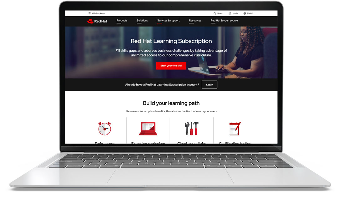
The Red Hat Learning Subscription offers paid participants the option to have access to all or most of the Red Hat online courses and exams
To improve the customer journey and better represent the value of the program
Adobe XD, HTML, SCSS
RHLS is one of the top most visited pages on redhat.com and RHLS is responsible for a large portion of the company's revenue. The program is constantly evolving and it's important to serve the most relevant information to the subscribers and the potential buyers. Some of the new features the curriculum teams wanted us to incorporate into the page included a developer tier and a 7-day free trial widely promoted by the marketing channels.
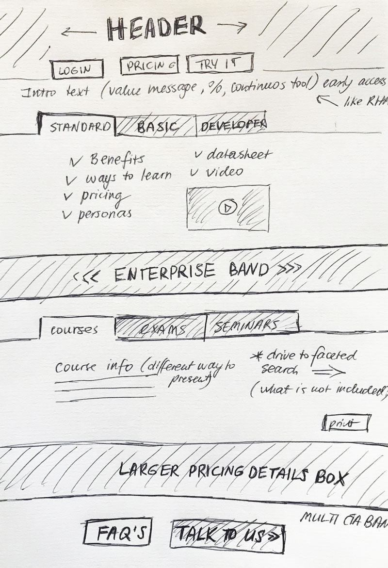
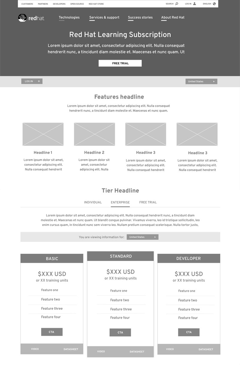
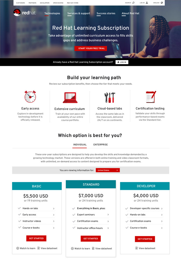
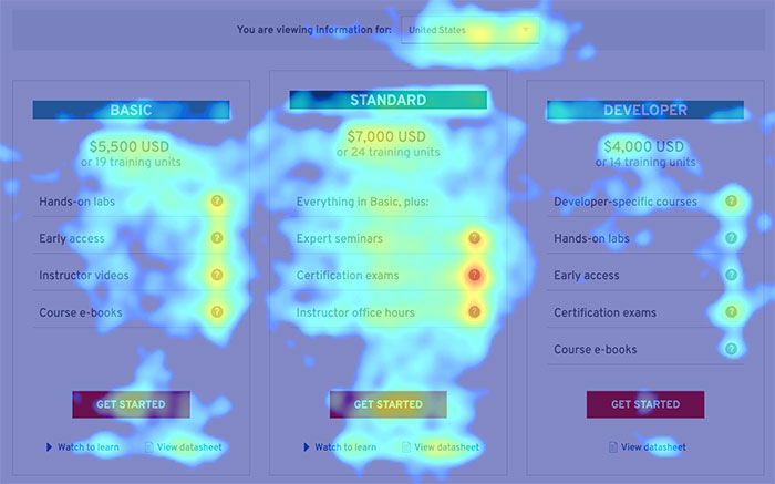
Subscription boxes are reordered to appear much higher up on the page. Some of the content moved into the FAQ section, significantly reducing the page length. Better visual representation of the subscription tier boxes. Overall lighter color scheme and new icons to keep up with the new brand standards.